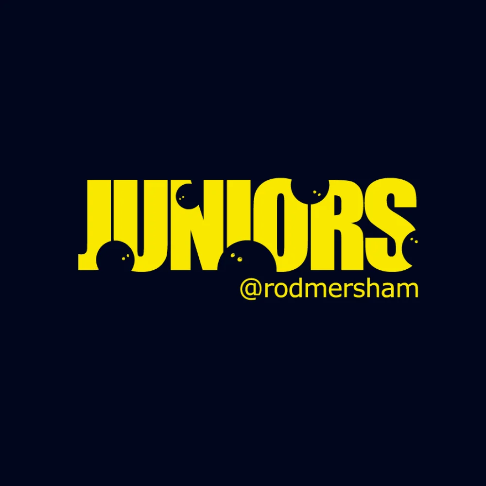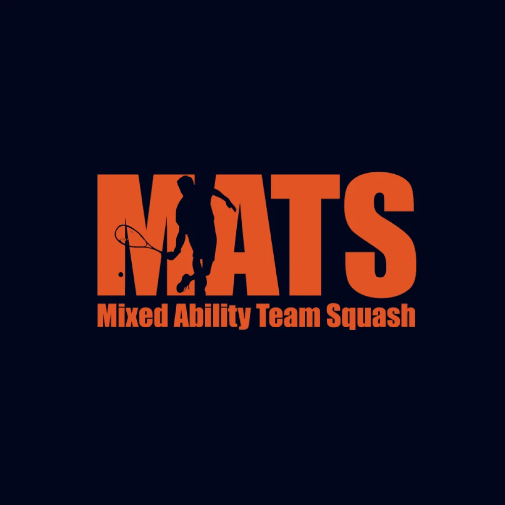

A family of six logos that make every member of a Kent squash and fitness club feel welcome, and part of their own community.
The Club @ Rodmersham is a squash and fitness club with a lounge and bar, used by families, juniors, ladies, competitive players and people who simply want to keep fit. The brief was to create a welcoming feel for everyone, to give each group its own identity so that every member feels included, and to keep the logos clearly visible, easy to read, simple and clean.
What we did
- Large, bold lettering so each logo is clearly visible and easy to read, in a simple, clean single-colour design.
- One friendly wordmark shared across every logo, so each group belongs to the same club.
- A picture hidden inside each word that shows the people it is for: a family for The Club, a runner for Fitness, squash players for Squash, Ladies and MATS (Mixed Ability Team Squash), and squash balls bouncing through Juniors.
- A colour for each community: blue for the club, lime green for fitness, orange for squash and MATS, yellow for juniors and pink for ladies, all with the club’s @rodmersham handle.